The story behind BBC2's new identity

The Background
For those of us who work in agency land, it’s not uncommon to see the same brief quite a few times with a long-standing client.
So imagine how the in-house creative team at BBC Creative must have felt when a brief was issued for the first time in 20 years for a new set of on-screen idents.
Almost certainly not one of them would have been there the last time the idents were conceived so welcome to unchartered waters.
The idents formed the major part of a new rebranding of the channel and, working with external designers and animators, the team has created an exquisite set of visual assets.
The Big Idea
For those of us of a certain age, we’ve grown up seeing the BBC idents evolve and each set almost defines different generations.
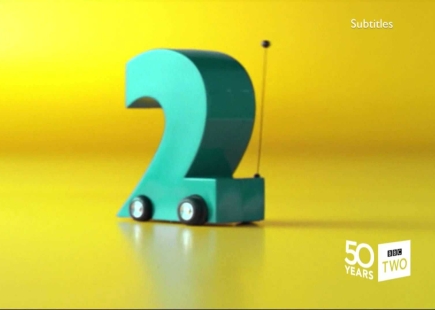
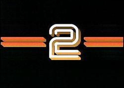
Personally, I can still see the remote-control 2 flying around the screen and it takes me back to favourite programmes long since passed their sell-by date. But time moves on and so does the 2 idea.
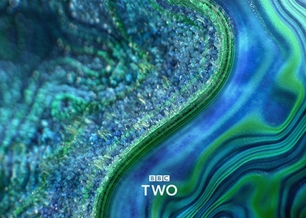
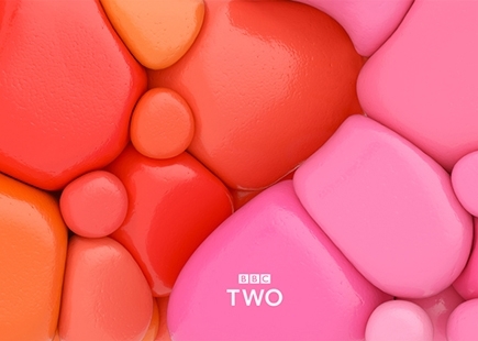
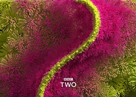
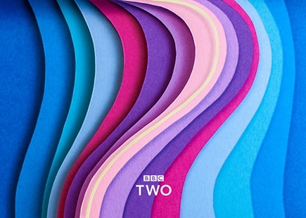
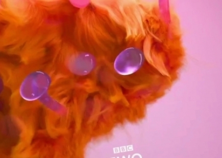
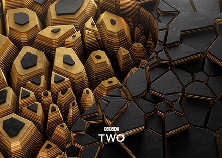
Now it’s all about curves. The curve thought comes from the shape of a 2 and has been brought to life in 16 diverse idents which will be seen on-screen and online.
What They Did
The in-house team worked with 16 different animators to give a uniqueness to each ident with each one briefed to deliver a curvaceous idea. There’s everything from folded paper and bubbles to geometric wood shapes and crystal layers.
All are crafted and perfected to present the channel as modern, contemporary and stimulating. With such an eclectic programme schedule from natural history documentaries to hard-hitting experimental drama, it was important to reflect this breadth in the executions and each one is certainly a little gem squeezed into 30 seconds.
The idents come from familiar UK names like Aardman to more obscure animators from around the world, and it’s clear that they were given free rein to bring their visions to life.
Just what us creatives like.
The Review
In two words – love ‘em!
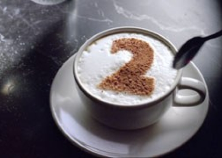
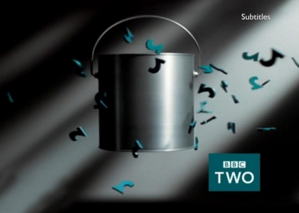
In fact, I wished I had worked on it. I can see these going on from here and becoming a signpost for today’s generation in the same way flying paint cans and 2 cappuccinos were in my formative years.
With a brief to bring to life the diverse and refreshing mix of programmes, these visual stunners really hit that brief.
I even love the fact that the sound for each one is based on the same two notes and really adds to the atmospheric feel.
Everyone involved should be congratulated for showcasing this great British brand in such a creative way which really reflects what the channel is all about – quality and variety.
And if you really love the nostalgia, here are a few of my ol' favourites...
In Hindsight
Not really sure how these could have been improved, as for me, they are perfect. Looking forward to see what new ones come along as they are reported to be working with sculptors and people from different creative backgrounds for the next ones.
Just brilliant – nothing else to say!
If you enjoyed this article, you can subscribe for free to our weekly email alert and receive a regular curation of the best creative campaigns by creatives themselves.
Published on:


