Data with meaning: How connecting through tradition and culture is the key

When we hear data visualisation we often imagine different sized circles or multicoloured pie charts on a big screen. We think of it as a concept born of the digital age: the art of computers.
But creative data visualisation is ancient and it is tactile.
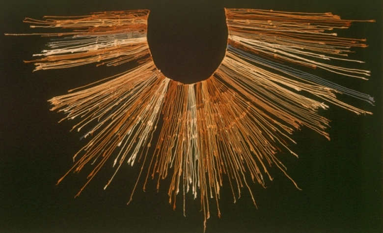
I was really struck by this when I found out about the ‘Quipu’, an ancient Incan device made from knotted strings. Quipus were made to visualise the data of the community with each string and knot representing a different ‘data point’. This could include census records, tax obligations, or calendrical information. It's amazing to think that someone could hold this, in many ways, simple object in their hand, and with it understand vast amounts of information about their entire community.
The oldest known Quipu is 4600 years old.

Community identity and material culture have been woven together for generations.
The Scottish tartan is perhaps the most notorious, but many other micro communities had their own way of communicating through cultural objects.
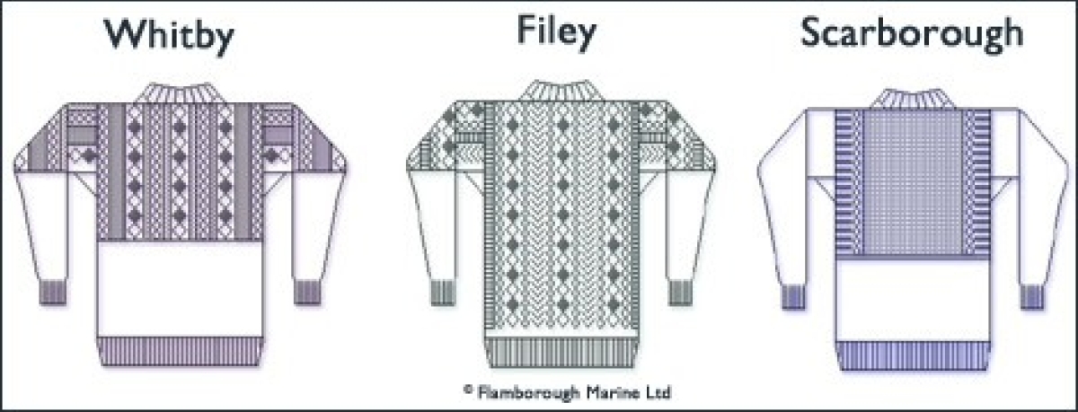
I grew up on the North East coast, in Sunderland, surrounded by the remains of different fishing villages. In the past, fisherman wore gansey (or guernsey) sweaters with each village having its own variation of a knitted design, often with custom details.
The story goes that if a fisherman were lost to the sea their body would be identifiable by the knit of their sweater.
It became their ID, the community’s visual DNA.

Moving forward to the present day the technique of using cultural objects as carriers of information is still in play.
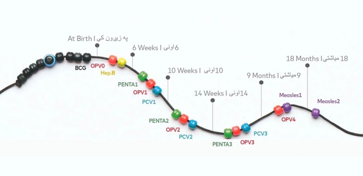
A campaign which, for me, was one of those ‘agh I wish I’d been working on that’ moments was The Immunity Charm campaign by McCann Health.
The campaign took place in Afghanistan, where millions of children’s lives could be saved by better immunisation practices.
Here there were two issues; unreliable communication methods between healthcare professionals, and the scepticism towards immunisation, born of traditional belief systems.
The Immunity Charm used the cultural tradition of a lucky charm bracelet given to babies to protect them from dark forces and turned it into a communication device for doctors by creating colour beads which fitted the bracelet - each a code for a different immunisation.
As well as the practical communication element, the integration of this medical data into something so intrinsic to the Afghan culture allowed a level of acceptance of the ‘new’, the concept of immunisation, in a way far more powerful than showing a graph of the statistical benefits of immunising your child.
‘Making immunity a tradition’ worked.

The key to driving change
Effective data visualisation is never impersonal, it is entwined with our material culture.
This is especially true when data visualisation is the method for communicating new ideas with habit changing asks. We can all understand a graph, it rarely has the ability to affect our emotions and to change our behaviours.
So when we are trying to visualise new data, the most effective methods connect that new information to things rooted in our existing culture and traditions - things that have meaning.
This is the key to driving change.
If you enjoyed this article, you can subscribe for free to our weekly email alert and receive a regular curation of the best creative campaigns by creatives themselves.
Published on:


