Toby Tinsley talks us through the creative process behind his iconic Virgin Galactic and Virgin Voyages figureheads

Who is Toby Tinsley?
Toby Tinsley is an award-winning graphic design and illustrator (and old friend).
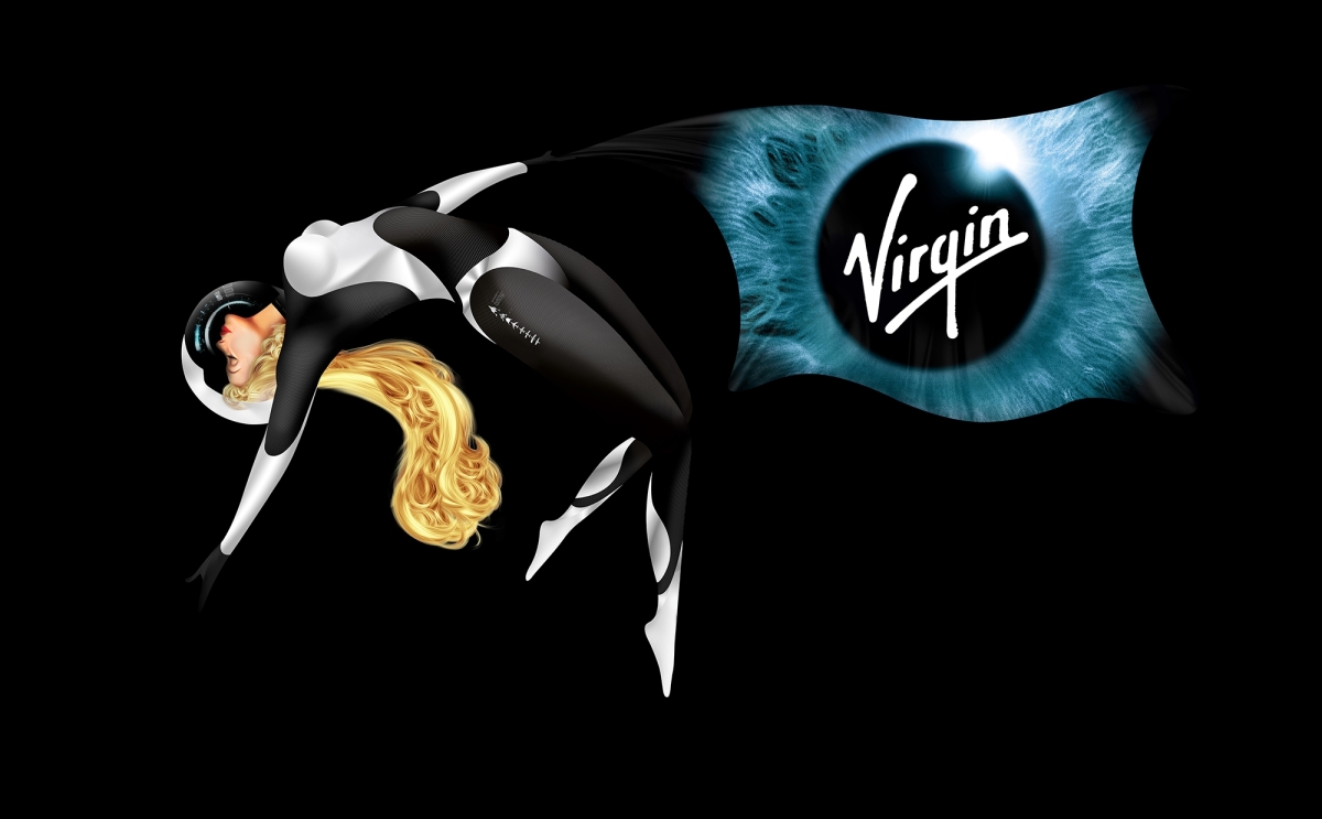
Toby was invited to design the now iconic illustrations for Virgin Galactic and Virgin Voyages.
Here, he talks our very own Creative Moment publishing director Lucy Smith through the creative processes behind these creations, where he took his inspiration from, what he learned and how making a fictional mermaid look real took over his life...

Lucy Smith: When was the design for Virgin Galactic created?
Toby Tinsley: Originally in 2007 and the update was in 2018.
LS: When was the design for Virgin Voyages created?
TT: It started end of 2016, with the first girl being released to the public in September 2017.
LS: From brief to final artwork, how long did it take to create these beings?
TT: About nine months per illustration, they are very large and very
intense to work on, so it is not nine months straight. I would do a
bit for a week, then send over to the client – they then respond a
couple of weeks later so you get a good time away from it. When you
revisit it everything that is wrong with it pops right out, so that’s a
positive as otherwise you can become a bit blind to it.
LS: Was the brief specific or were you given free rein?
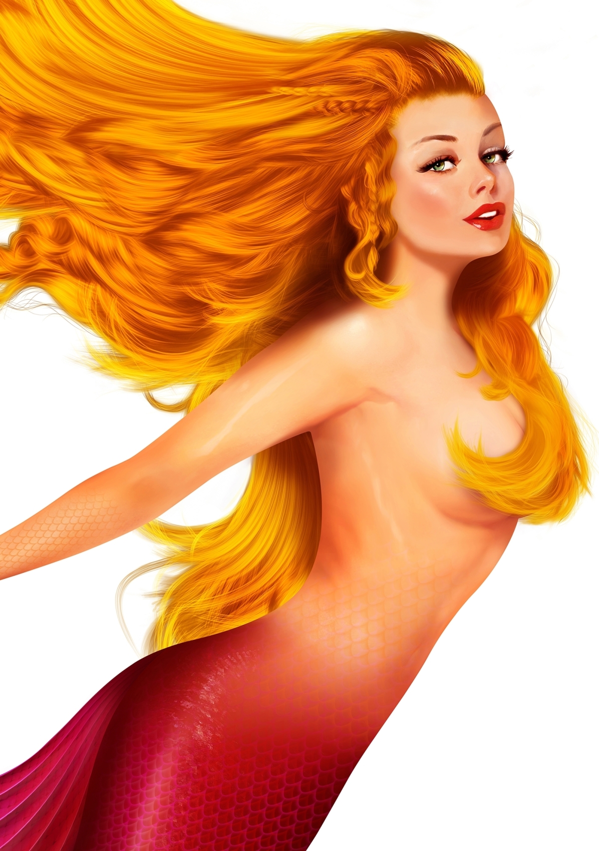
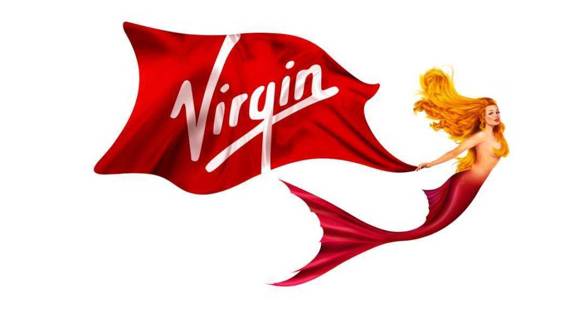
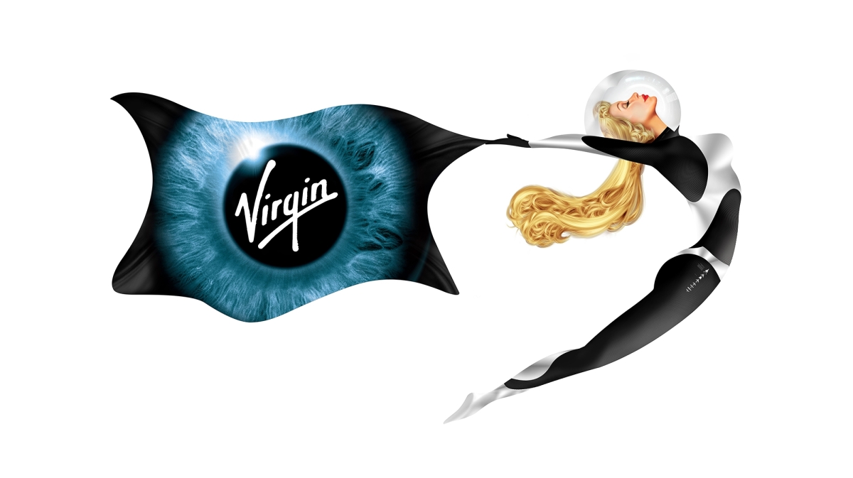
TT: On this one, totally free rein. For Galactic Girl I had to base the girl’s face on Richard Branson’s mum, Eve Branson, but for the mermaid I based the face on no one – it’s more generic that way. Literally everything on the mermaid was designed and illustrated from scratch with no external references having to be used.
LS: How much did this project take over your life?!
TT: A lot! Mermaids are tricky as no one (alive) has actually ever seen one, so there are many interpretations of what they look like and how they behave. I ended up reading a lot about the myths and legends of these ‘mer-creatures’ to understand how they are made up.
LS: Do you tend to manage your projects in the same way?
TT: This particular project was very different so nothing was routine about it – because it is effectively a life drawing, if one part of the pose changed, then the whole body changed – one tweak of the face and the entire mood and personality changes.
This really was a case of one step forwards and two back as you are constantly finding out what works and what doesn’t. Because you cannot go to the beach or the sea and take photos of mermaids for reference, there is nothing to base this on.
The closest thing are the mermaids from The Pirates of The Caribbean, but ours needed to be more inspiring and aspirational and not evil!
LS: Do you have a specific way in which you work in terms of how best to create the right environment for an idea, or does it just happen?
TT: I always find that the best way to work is talking to the client – it doesn’t matter where you are, they are the people that know best and know what they want. Ideas can come from just letting a conversation flow which turns into a brief without you really knowing about it.
I hate ‘brainstorming’ – forcing ideas out – after a brainstorm you may be stuck with a concept that will not work in the long run.
Ideas and concepts grow from research and human interaction.
I have always believed that the best design in 90% thinking and 10% doing.
LS: You mentioned the original inspiration for the work comes from something very personal to Richard Branson, can you tell us more?
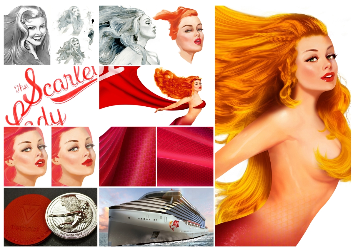
TT: Galactic Girl yes – as this was based on his mother, but also Virgin as a brand has a tradition of using the nose-cone art on its fleet of transportation. Virgin Atlantic has a Flying Lady, designed and painted by Ken White – back in the day when you literally had to paint the artwork onto the plane.
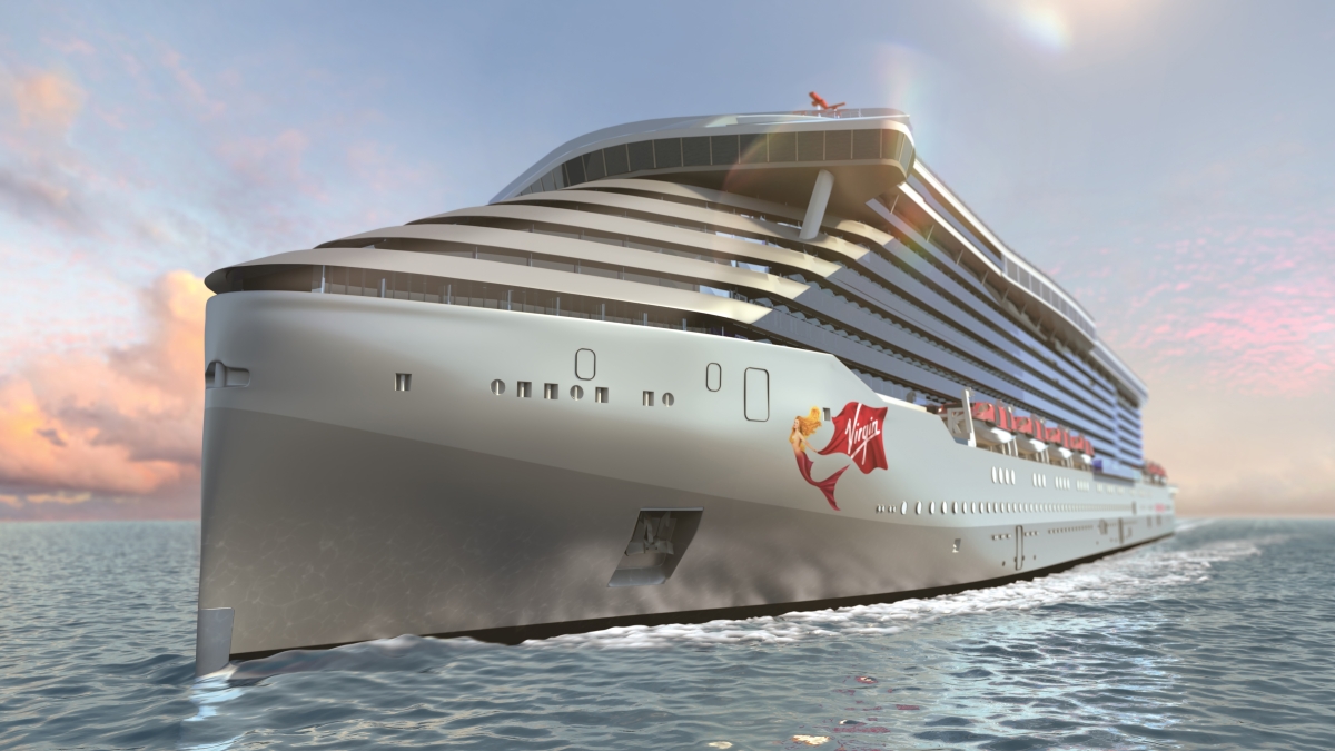
So the Scarlet Lady is a continuation of Virgin brand tradition as well as nautical boat building tradition – there was always a figurehead on boats as a good luck symbol for the sailors.
LS: Dealing with the creation of a female figure, how careful did you have to be in ensuring you didn’t cause offence or fall into the traps of stereotypes and cliches?
TT: The Scarlet Lady was created to be inspiring and aspirational – but also to be true to a mermaid. She is beautiful, but in an approachable way.
Female figures have been used on boats as far back as the 13th century – it is a nautical tradition used worldwide. They symbolise grace and mobility, swiftness and protection.
They were phased out around 1894, so it is very nice to see a modern interpretation of an ancient tradition.
LS: How much of the process was the idea and how much was the interpretation/implementation?
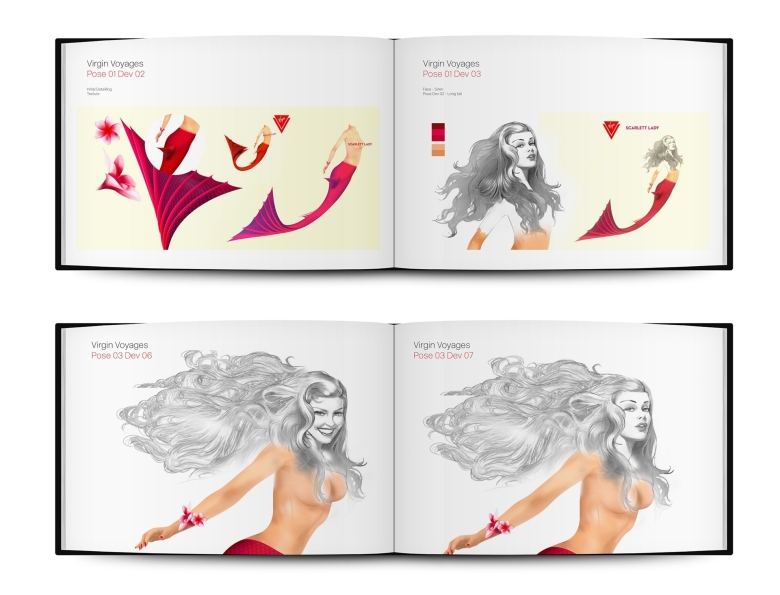
TT: This was a mermaid from the outset, so the ‘idea’ was already there – it was really just a case of how to make her work, how to fit her into the brand, and how her personality of being inspirational, approachable and a leading woman comes across.
And that took nine months to figure out.
LS: You collaborated with others on this, can you tell us a bit about how they fitted in?
TT: Fay Dalton specialises in retro and classic style painting and has done some fantastic work in publishing – most notably the Ian Fleming 007 books. She came on board to work with me on the face and help to get the body proportions correct for the chosen pose.
Ed Anthony is a portrait artistic – the detail in his drawings is phenomenal and he played a key advisory role – and Rayne Morgan from the USA specialises in digital airbrushing and we used a lot of her tools to create the hair.
It was very much a ‘pass-it-around’ process of when I finished my bits, Fay would tweak and comment, Ed would observe and add guidance and so on – but as the lead designer and illustrator the buck stops with me, so I had to ensure it is 100% perfect.
LS: What did you learn from working with a company like Virgin, the collaborative process and generally on working on this kind of design?
TT: I think on something like this, as with Virgin Galactic, you wouldn’t be asked to undertake such a massive project if Virgin was not confident in your skill set or abilities.
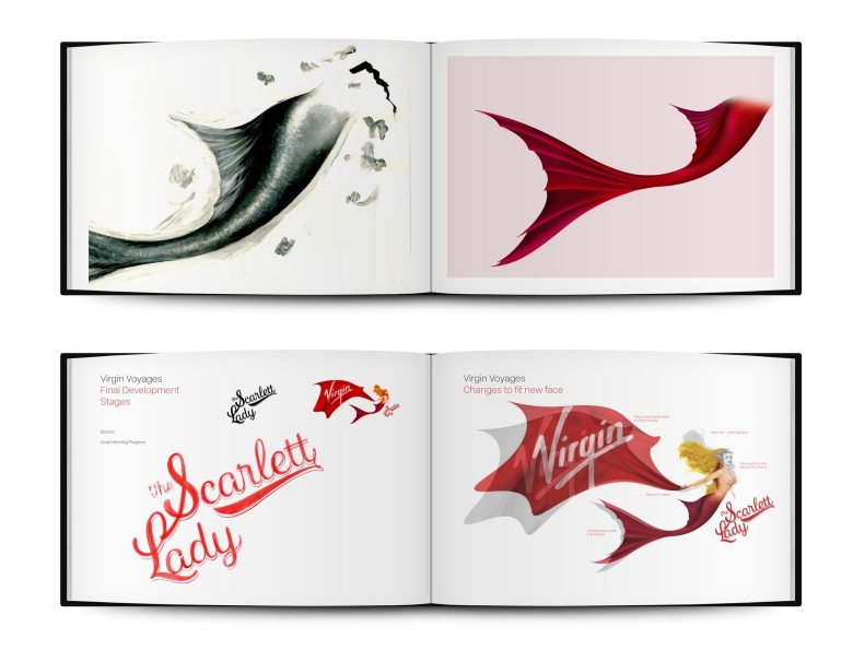
It always is a lot harder than you would think, as it has never been done like this before – a 10.5-metre-long mermaid in ultra-high definition is by no means an easy task, but Virgin is a great brand and the people who work there reflect that.
They are fantastic clients who really know their stuff and they are there to help and collaborate rather than tell you what to do.
LS: Did you learn any new techniques?
TT: Loads! Digital airbrushing is something I had never done before, and it took a long time to get into it. I am a self-taught illustrator as my skill is in graphic design, so I had to sharpen up fast.
LS: Apart from having a similar finish, what themes from Galactic did you want to make sure ran through the Voyages’ design and why?
TT: Just to be noticeable as part of the family…
which can be achieved through style, the personalities of Galactic Girl
and Scarlet Lady are very different so any themes that relate them are
purely technical.
LS: I’m sure you are proud of all the work you have done, but what does this project mean to you and why?
TT: It means a lot because it has longevity - once the girl is on the ship, she stays. This is not an ad campaign with a lifespan – this will be for as long as the ship is sailing my grandchildren will most likely see it. And they will probably be on the Virgin Galactic spaceship with my work on it too!
LS: Is there more in the pipeline that you can tell us about?
TT: I can’t tell you anything, but there are four ships so I’ll leave that up to your imagination…
P.S. I did also ask him if he received a discount for a ticket into space on Virgin Galactic but he declined to comment.
If you enjoyed this article, you can subscribe for free to our weekly email alert and receive a regular curation of the best creative campaigns by creatives themselves.
Published on:


